No one’s much surprised, but the Democrats are losing opportunities in the messaging war on tax reform. In a gleefully titled “reality check” oped, Fox News and Townhall contributor Guy Benson recently referenced an old USA Today fact check which called the Democrats’ rhetoric ahead of the Trump tax cuts “misleading.” It’s news now because of a Bloomberg piece analyzing 2016 tax data made available by the IRS in August. While that piece is not as hostile to progressive taxation as it might be, it is itself misleading in several ways and clearly seeks to emphasize to the same startling result from Benson’s piece: just over half of federal individual income taxes are paid by the top 3% of taxpayers when ranked by gross adjusted income (AGI).
Benson seizes on this to assert that the “Left’s political stories about ‘fair shares’ and ‘millionaires and billionaires’… [are] not grounded in facts and omit crucial perspective.” But it is Benson and his tax cut apologists — making claims like “we have a federal spending problem, not a revenue problem” — who lack crucial perspective. A careful reading of the very Bloomberg analysis that motivated Benson’s opinion shows just how bad a revenue problem our nation has.
The Bloomberg piece is mostly graphs and one-liners seemingly designed to demonstrate how well the rich are paying their share [1]. But the graphs also appear to be intentionally misleading. It isn’t clear at a glance that the taxpayer percentiles group the 140.9 million individual taxpayers ranked by AGI, and both cumulative graphs have pseudo-logarithmic share axes without much visual indication of how skewed they are. In one instance, this makes it appear that the tax burden of the upper quintile of earners — Bloomberg’s target audience, no doubt — is particularly severe.
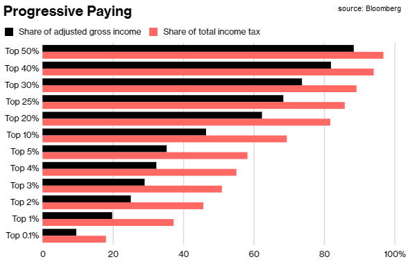
The above graph that Benson tweeted and embedded in his piece is the emphasis of the 3% headline. It cumulatively graphs the share of AGI and share of total income tax for the same pseudo-logarithmic upper percentile groups. The ratio of the two are strikingly uniform across the entire spectrum with somewhat more differentiation between about the top 15% and top 5% of income earners. The rich are clearly paying their fair share, with the top 3% really taking one for the team, right?
Analyzing the Bloomberg Analysis
Luckily the actual data points, to 3 decimal places, can be plucked right from the graph. It was simple then to uncouple the AGI cumulativity to see what each percentile group marginally added to both tax and AGI shares. The ratio of the two is some measure of the “progressivity” of the tax scheme: the closer those values are for any percentile group, the closer (on average) to a flat tax that group in fact pays. Values greater than 1 indicate that group is a “progressive” payer, paying more in marginal tax than it earns in marginal income.
| top percentile | % income share | % tax share | progressivity |
| 0.1 | 9.516 | 18.124 | 1.905 |
| 1 | 10.206 | 19.193 | 1.881 |
| 2 | 5.335 | 8.368 | 1.569 |
| 3 | 3.95 | 5.325 | 1.348 |
| 4 | 3.293 | 3.991 | 1.212 |
| 5 | 2.897 | 3.229 | 1.115 |
| 10 | 11.368 | 11.243 | 0.989 |
| 20 | 15.793 | 12.385 | 0.784 |
| 25 | 6.071 | 4.111 | 0.677 |
| 30 | 5.209 | 3.344 | 0.642 |
| 40 | 8.394 | 4.764 | 0.568 |
| 50 | 6.38 | 2.882 | 0.452 |
Since the article and graph both focus on the top few percent of AIG-ranked taxpayers [2], I looked first at those groups too. There’s a clear exponential regression in the progressivity of those groups — except for the smallest and most critical one, the top 1/10th of 1% of taxpayers.
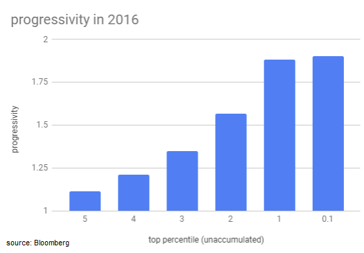
Bloomberg’s data say close to one tenth of all AGI, or about $970 billion, went to the top 0.1% of taxpayers (about 141,000 individuals). Each one of them earned nearly seven million dollars on average in 2016. It isn’t surprising then that progressivity begins to fall apart for these high earners under a tax code that doesn’t distinguish them from the admittedly well-off earning just under half a million dollars.
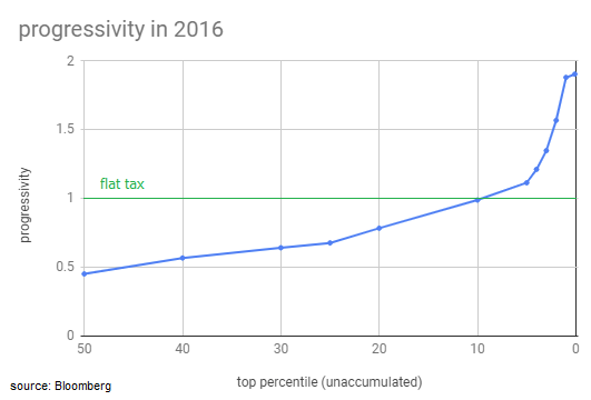
But the shortfall of that top group is even more striking when we consider the overall progressivity of the scheme for the top half of taxpayers.
Arguments about the relative fairness of our progressive tax scheme abound; but under that system it is quite obvious that tens of thousands of the mega-rich are not paying anything like their fair share, at least when compared with the almost-as-mega-rich just next to them in the AGI rank. If all else were held constant while that trend were modestly extrapolated to move the top 0.1% from a progressivity ratio of 1.9 to, say, 2.2, it would have resulted in more than $40 billion in additional tax revenue in 2016.
The progressivity graph also shows us how generally unprogressive our scheme is. The curve is slightly steeper from the top 50th percentile than it is between the 40th and the 25th. That suggests that upward income mobility is more harshly punished by increased taxation among the lower middle class than among those doing marginally better.
The curve clearly inflects starting at the top 25th percentile and is quite linear all the way to the 5th. A smoother exponential curve here would better fit the overall trend and result in a slightly more progressive scheme for those 1 in 5 taxpayers who were collectively within 5% of paying a flat tax. In fact, fewer than 1 in 10 taxpayers is paying progressively; nearly 2 in 5 are getting less than “half off” what they would owe under a flat tax, with half of those getting less than a third discounted.
More To The Story
There’s frankly a lot missing from this approach to understanding income tax. The data points Bloomberg presents lump a lot of people together but with much higher precision near the apex of the income ladder. The actual income ranges among these percentiles is perhaps deliberately obscured. But the raw IRS data breaking down the numbers of returns received in specific dollar AGI ranges cast some additional light.
The data are hard to parse and somewhat disagree with Bloomberg’s analysis: the IRS reported receiving 150 million returns in 2016 but declared only 100 million to be “taxable.” Where Bloomberg got their 140.9 million returns number is unclear, and that significantly shifts the percentiles, especially at the high end where Bloomberg groups them more tightly. But they do roughly agree with the IRS on total tax revenue of $1.446 trillion collected from $10.23 trillion earned in AGI.
Suffice it to note a few interesting takeaways from the raw 2016 IRS data:
- AGI of $200,000 puts a return in the top 5th percentile
- Only a quarter of all returns reported AGI of at least $75,000
- The effective tax rate (as the simple ratio of tax paid to AGI) was between 28% and 29% for those earning between one and ten million dollars but was just 25% for those earning above ten million
- That missing $40 billion from the top 0.1% would cover nearly the entire tax bill of the bottom 40th percentile, each of whom reported less than $40,000 in AGI
If this isn’t a perverse revenue problem — for the government and for the majority of taxpayer earnings — then I don’t know what would constitute one. If a hundred thousand or so mega-mega-rich taxpayers just paid what is clearly their fair share when compared with their merely mega-rich neighbors, well more than a third of all taxpayers could instead pay nothing and it would be revenue neutral. That’s to say nothing of altering the scheme to be more progressive in general or finding other ways to address what is obviously staggering income inequality.
In this light, it’s truly remarkable that Democrats could be losing the messaging on this situation badly enough to allow a tax cut that even the Bloomberg piece admits makes “the biggest benefits go to the top earners” — though only in its final sentence and after a dense historical table, of course. Here’s a more interesting “reality check”: is it less charitable to dismiss Democrats as hopelessly incompetent or to believe that they’re too deep in wealthy pockets themselves to argue for any meaningful change?
Footnotes
[1] The very first sentence of the piece is this: “Individual income taxes are the federal government’s single biggest revenue source.” The elephant in the room, which is not discussed at all, is corporate tax. In 2016, taxpayers reported a total AGI of $10.2 trillion dollars. Corporations collectively profited about $8 trillion that year, so clearly their incomes were much larger than $10.2 trillion. That individual taxpayers are the single biggest revenue source — which is quite true, netting the government more than four times as much as corporations in 2016 — is a testament to how much our market economy favours corporate interests.
[2] Choosing to focus on the top 3% was obviously for the sake of a headline since their contribution just crossed the half-way point of tax revenue. But really, the top 2% got us most of the way there, to more than 45%. And in fact, just the top 1% paid well more than a third of all taxes in 2016, or close to three times what the other two top percenters contributed combined. Of course, focusing on the 1% is probably not a rhetorical choice Bloomberg would make. And surely they wouldn’t focus on the 1 in 10 of that 1% that both paid and earned nearly as much as the other 9 put together.